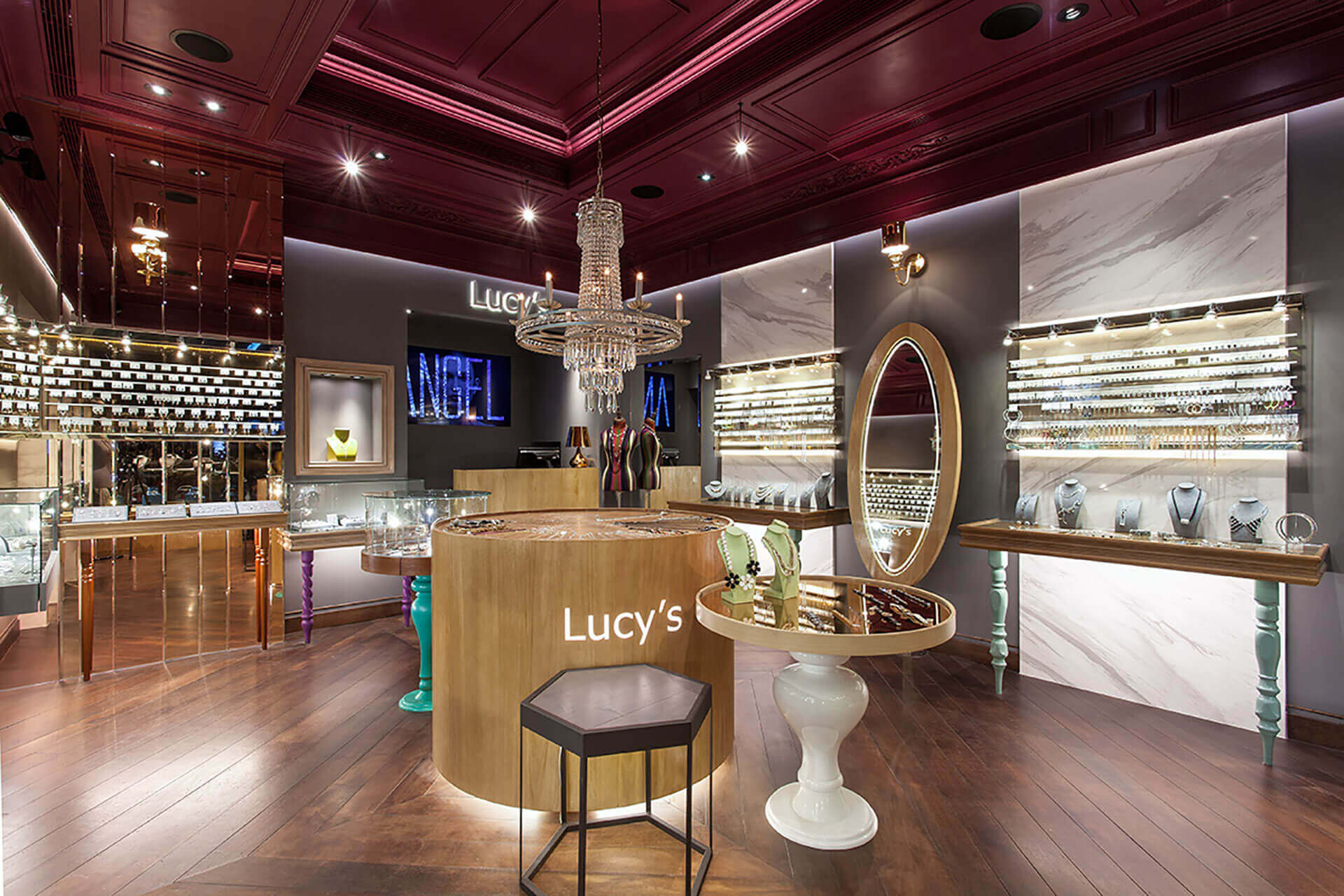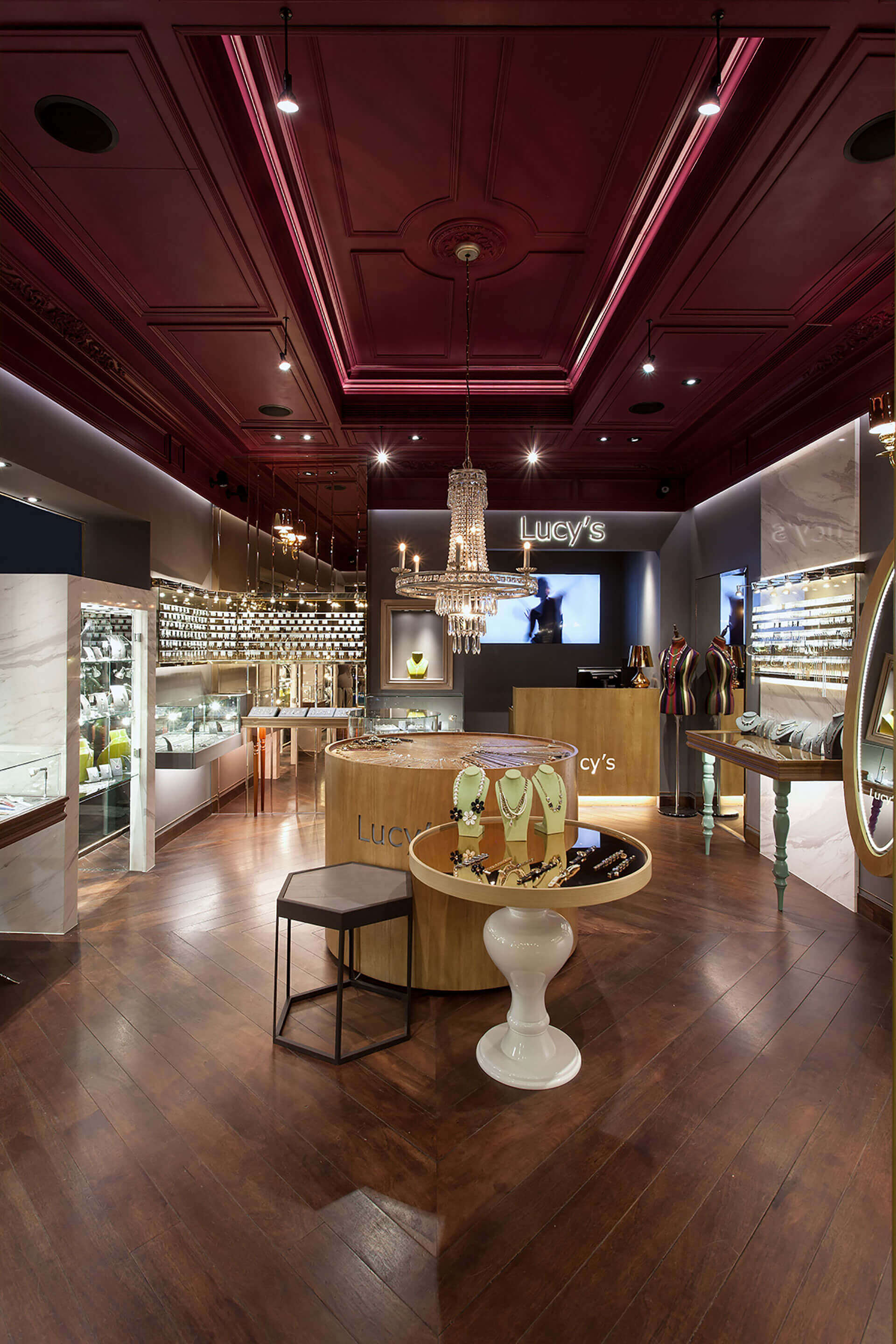
囿限於商圈往來人潮與窄狹坪數,如何在有限的空間和時間內,發揮坪效運用並重塑品牌視覺,成為我們設計思考上的一大命題。為因應飾品店的大多消費族群為女性,我們由此審美視角出發,延續古巴帶給我們的視覺衝擊,於天花板暈染大片的葡萄酒紅,搭佐金屬、石材和木質立面,使空間形塑截然不同的高貴視感,讓身處其境的人們,感受帶點奢華又不感壓迫的購物體驗。考量整體氛圍會顯得過於有距離,因此將門面設計為通透開放之形式,藉以拉近場域內外的距離,而這樣兼具藝術色彩、人文考量的門市形象,也讓品牌成功創造話題、進駐專櫃,後續更拓點設櫃、足跡遍佈。
Considering the crowds and the confined space in the business district, how to play a role in the limited space and shaping and promoting brand image has become a major proposition in design. In order to cope with the fact that most of the consumers in jewelry shops are women, therefore from the aesthetic angle, dyed burgundy red hue of the large area of the ceiling, and assorted with metal, stone and wood to set up an extremely noble visual sense, so that people in the store can feel sumptuous without oppressive while purchasing. In order to avoid the spatial constrained sensation, the entrance door is designed as an open configuration to bring closer the distance of interior and exterior. The image with both artistic and humanistic spirit also makes the brand successfully be the rage, further stationed brand counter.
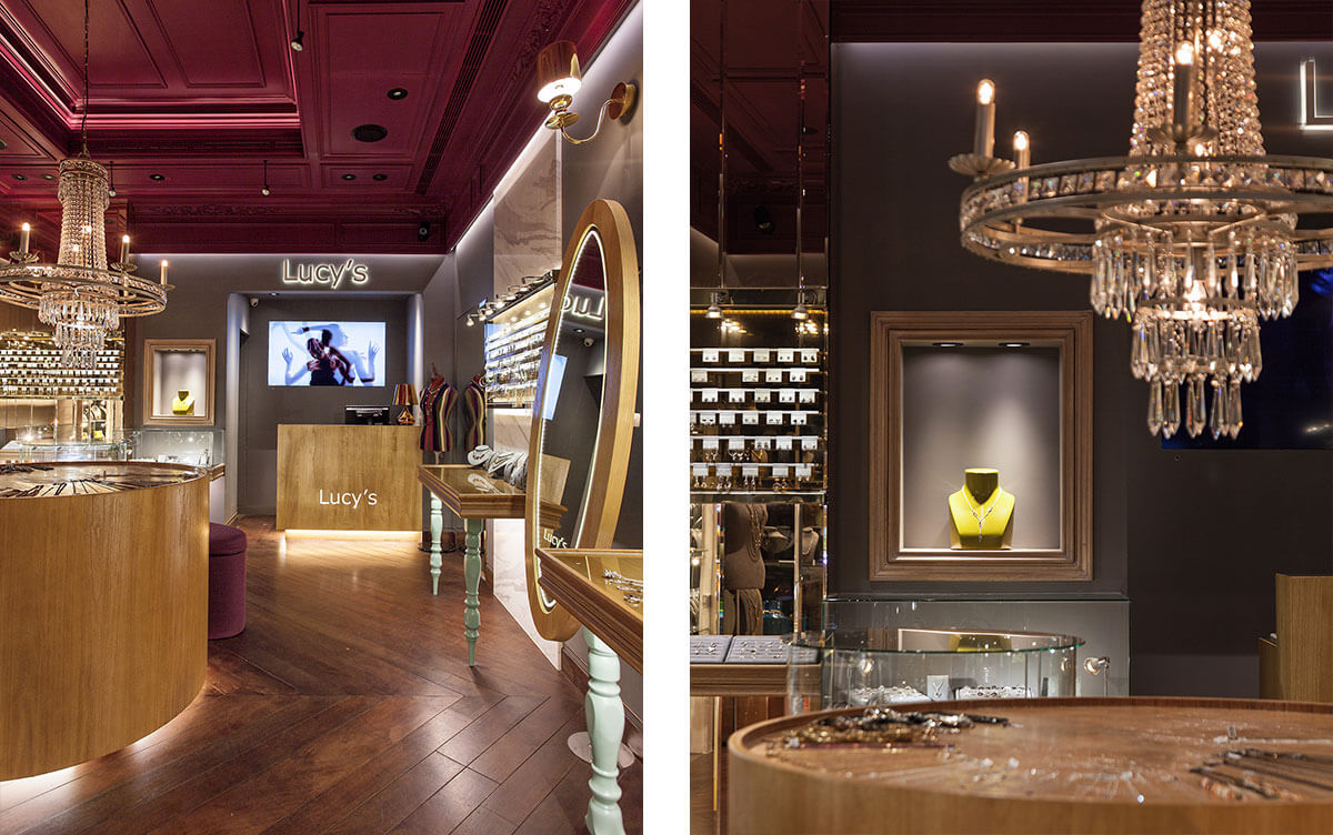
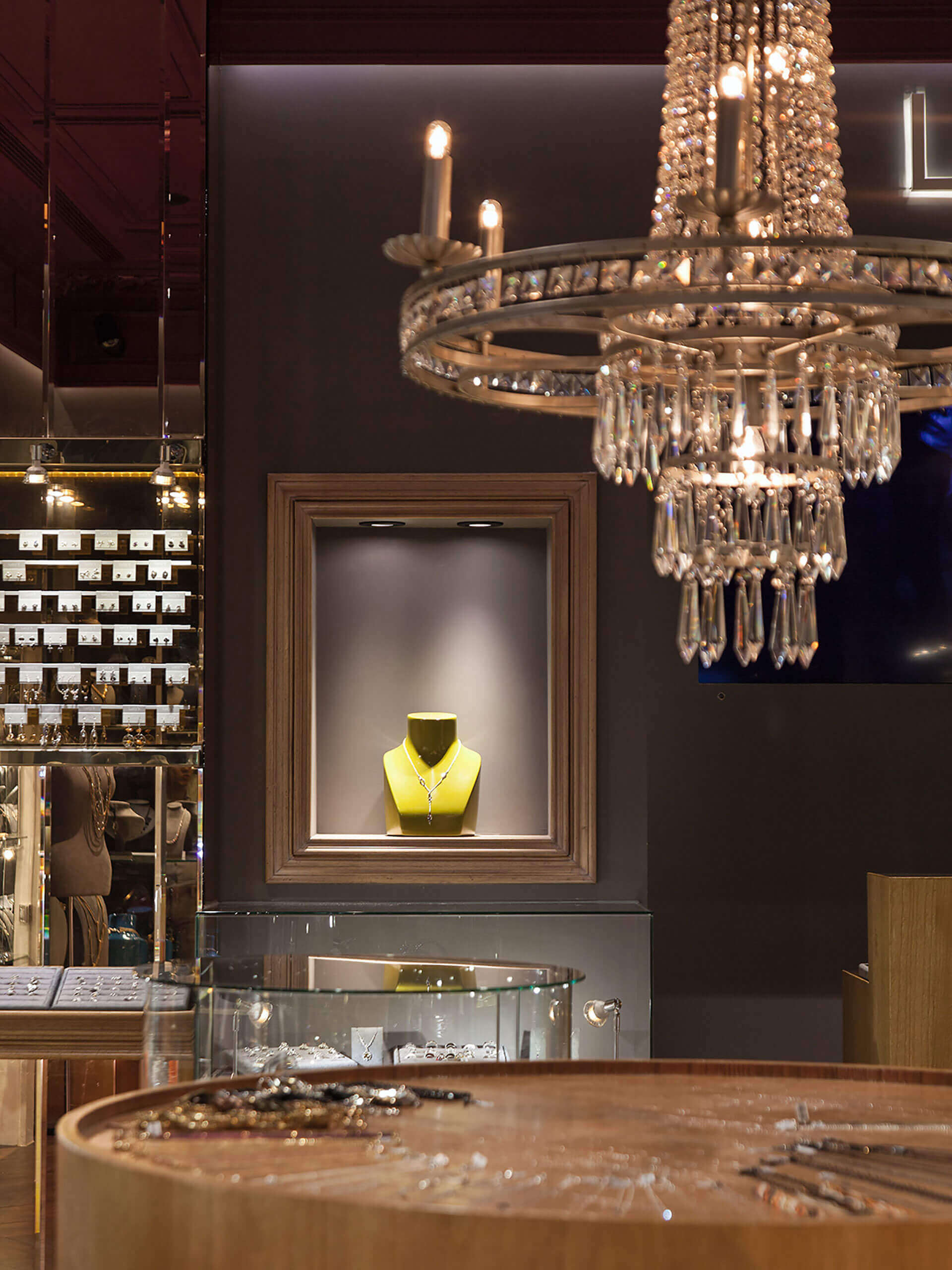
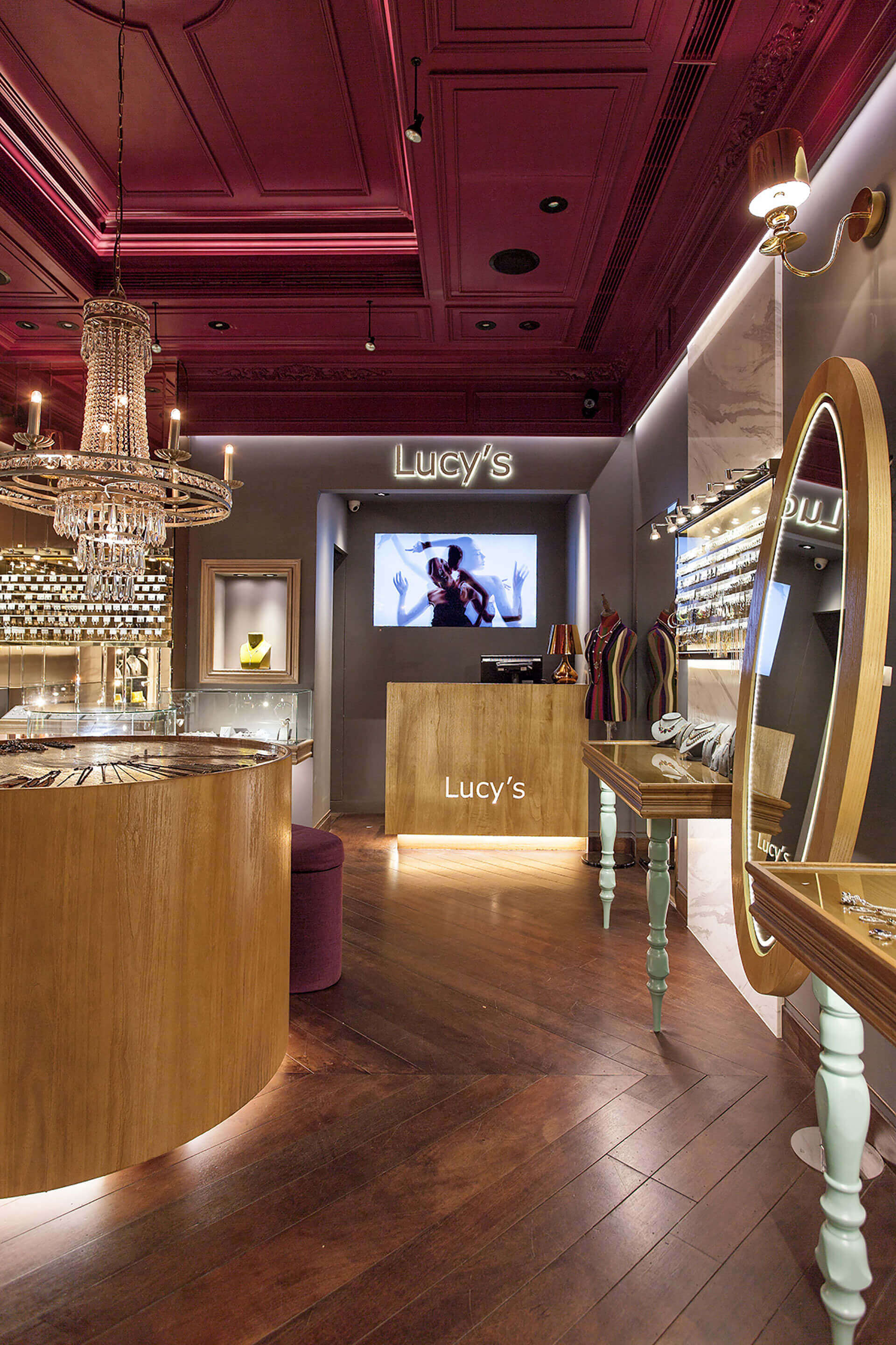
為讓過路的消費者能夠駐足於此,感受有別以往的消費體驗,因此我們延續古巴大膽而鮮明的印象,以該地顏色為取樣,將輝煌年代時的浪漫氛圍娓娓鋪陳;整體空間選用精緻雕工、鐵件等質材細膩貼飾,搭配鍍鈦金屬展架,凸顯飾品的精緻質感;當光線透射琥珀鏡面,反射出縷縷光暈,場域中的華麗視感由此綻現而出。過往我們吸收國外文化的最快路徑為「音樂」,而這亦是一種追循流行的象徵,又本案業主十分熱衷MTV(Music Television),我們便投起所好將興趣結合空間,讓同屬流行產業性質的飾品店,能夠予人深刻的視覺亮點。為此特別邀請了MV界的鬼才導演跨界拍攝短片,於櫃檯背牆上播放,強烈的視覺感受和抽象傳達,也為店內空間挹注一股動態視感及時尚氛圍。
For the purpose of appealing the passing consumers to stay and experience different consumption sensation, sustained the bold and distinct impression of Cuba to bring about the romantic atmosphere of the brilliant era; the whole space is composed of exquisite sculptures and iron pieces with titanium-plated metal display racks to highlight the fine and smooth texture of the jewels; when light reflect through the amber mirrors, spread the magnificent temperament of the space."Music" is one of the fastest approaches to assimilate foreign culture, which is also a symbol of the pursuit of fashion. The shop owner is keen to appreciating MTV, thence the designer decided to put the interest into the space, which is as well belongs to the fashionable section. Accordingly, we invited the talented director of music video to shoot a short film, and broadcast on the wall at the rear of the counter, which provide people a stunning visual highlight, furthermore imbue rich vogue ambience of the space.
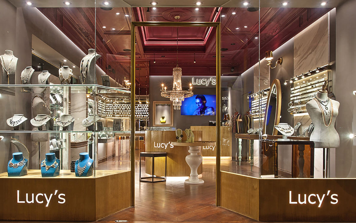
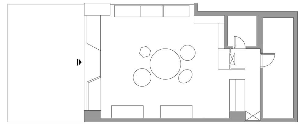
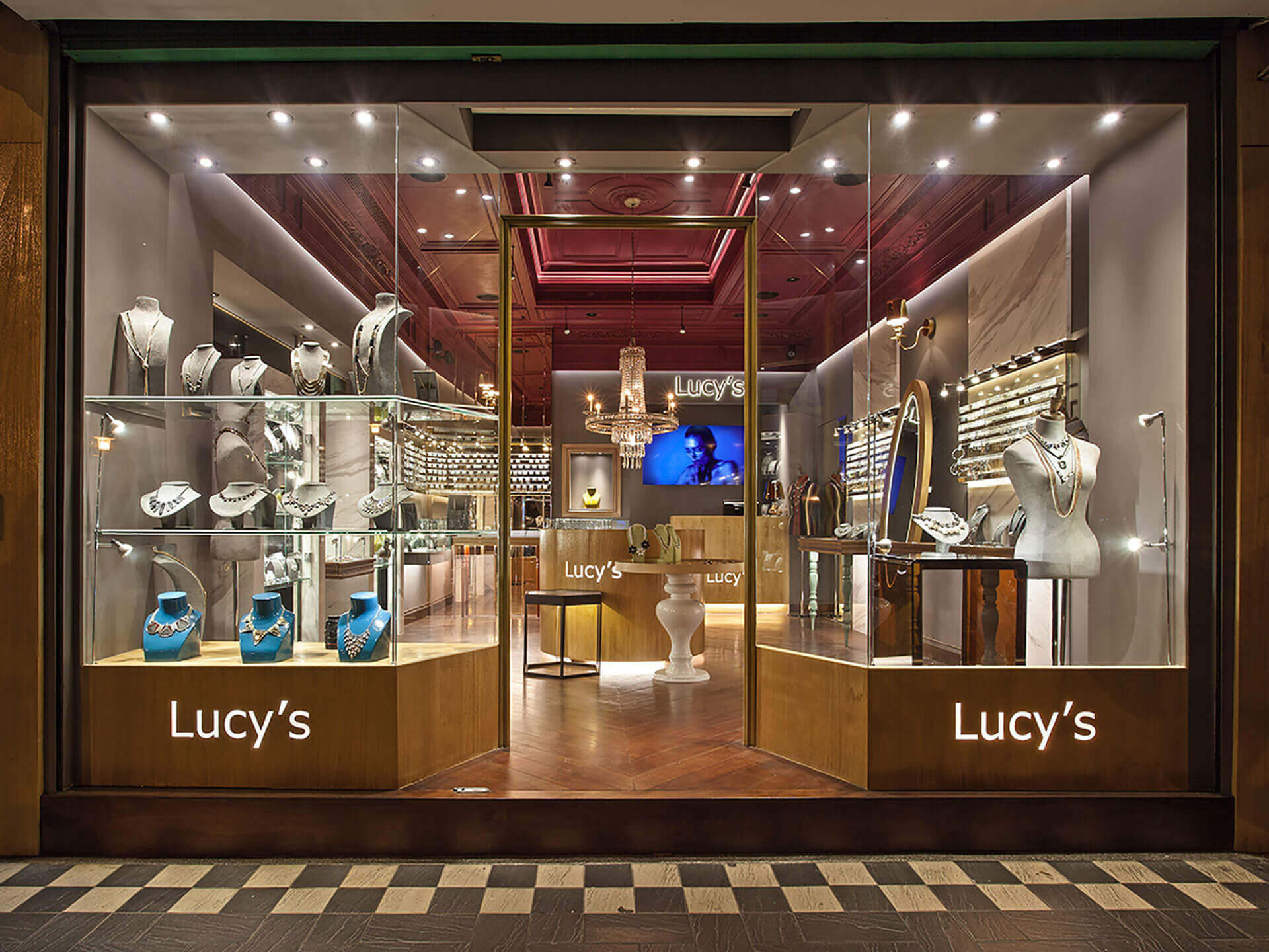
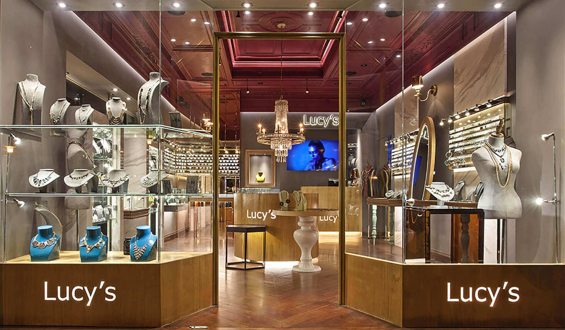
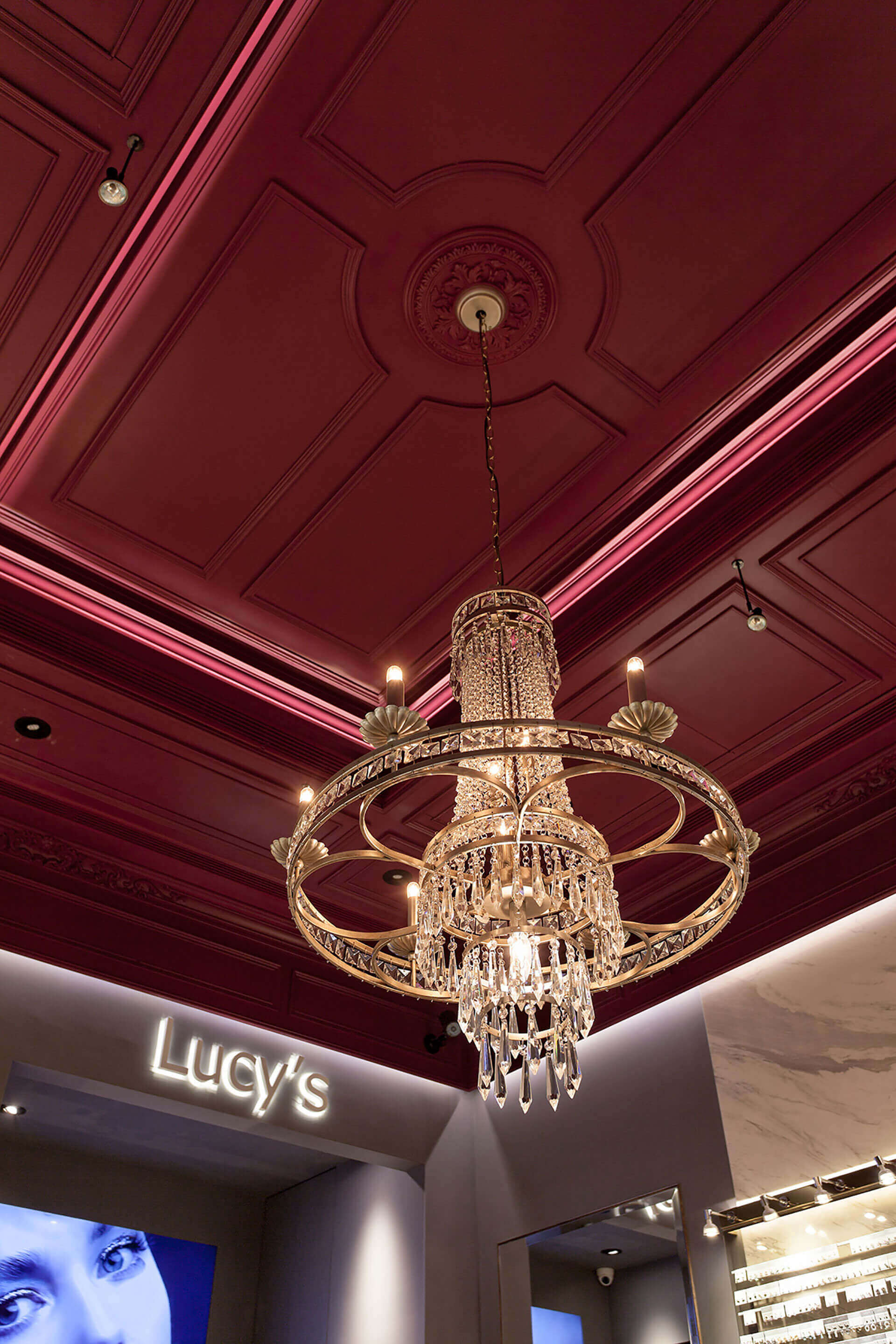
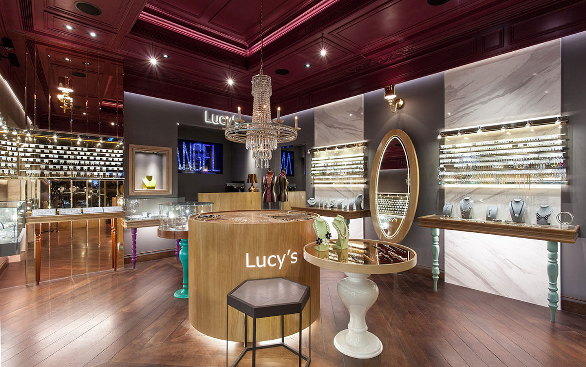
考量小坪數的格局限制,於是將空間的軸線思考延伸至外,以大面玻璃櫥窗及微幅限縮的入口,打造通透開敞的視覺感受;兩側櫥窗除了建構品牌形象,更為室內空間挹注放大視感。場域內首先由天花板的大片葡萄酒紅揭開序幕,以挑高鏤空設計建構分層美學,並暗藏古典線板語彙,順勢而下的水晶吊燈拖灑而出場域氛圍,將空間中的畫面定格於此,精奢典雅浪漫旖旎。地坪則降低色彩亮度,通過菱形切割的木質夾板,構建擴散的放大效果。而為呼應飾品形體,在軟件挑選上亦特別選以圓形、六角形等造型邊桌,使場域呼應古典歐式語境。在重點區域牆面,則透過低明度、暗色調的牆面對比,讓目光聚焦於飾品上,輔以鈦金屬陳列架,使商品得已凸顯而出、盡顯奢華。
Taking the layout limitation of the small floor number into account, thus adopt the large glass windows and the slightly retraced entrance design to create a pass-through and openness visual sense; the shop windows in addition fashioned the brand image, furthermore enlarge the visual sensation of the interior space. Step into the shop, the burgundy red hue ceiling sets the scene to create a layered aesthetics by means of the elevating hollowed design and highbrow hidden trim. In addition, the exquisite, elegant crystal chandelier sheds the luxurious and profound atmosphere of the space. The floor reduces the brightness of hue, and employ diamond-cut plywood to initiate the effect of outspread. In order to fit in with the shapes of the jewelries, the European classical style side tables such as round and hexagonal shapes are particular chose in FFE selection. Through the contrast of low brightness and dark tinge of the wall, assorted with titanium metal display frames to highlight the luxury element of the merchandises.